Nowadays we can’t even think about living without internet and specially without smart phones and these technological devices have revolutionized our daily life and these devices have significant influence on us. Checking your emails or website using your desktop or laptop system getting diminished and people are using more and more devices like their smart phones and tablets.
Whether you are a student, teacher, employee or businessman you use websites to get info regarding your required field. Due to excessive use of internet on devices other than conventional computers this has become the need of the day that website of any type should open properly on any type of device. But as we want to open websites on different range of display sizes, a normal website doesn’t open properly on smart phones or tablets. The reason is this that they are not compatible with all the devices.
That is why all the business’s websites are moving on to Responsive Web Designing technology.
What is Responsive Web Designing
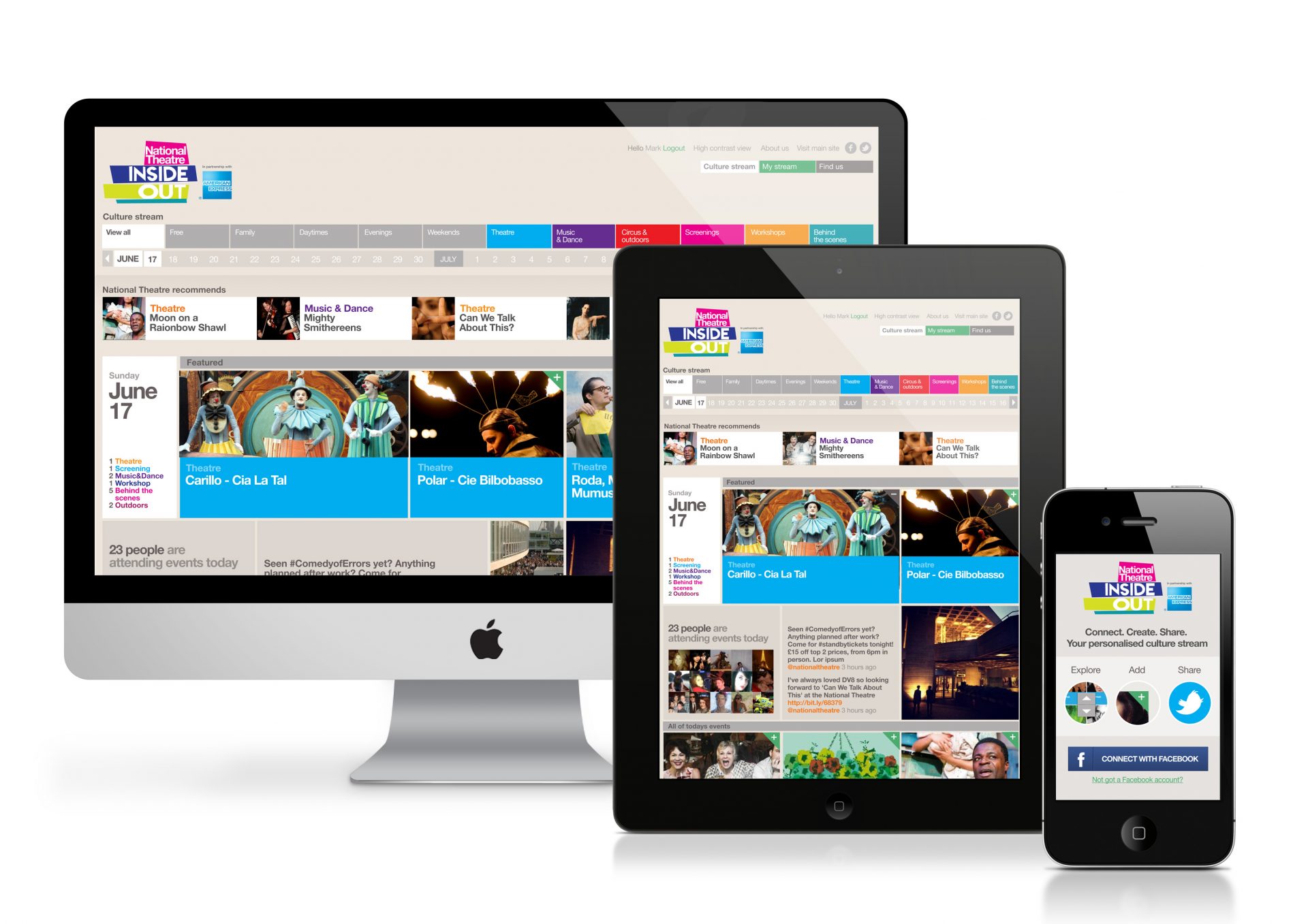
A website having the feature of fitting into any type of screen size or display device like desktop computer, mobile or tablet of any size is called responsive website.
Making website for every type of screen size is not possible but due to the requirement that websites should open on all the devices properly and it should not miss anything on any type of screen size. So answer for this type of requirement is “Responsive Web Designing” that means a technology or layout that has the features to fit into any type of screen size.
Responsive web design give you the proper and full view of information mentioned on the website in different patterns. Almost all of the website design houses are creating responsive web designing sites. creativeON has also been offering Responsive Web Designing and making unique websites using this technology.
Working of Responsive Web Design
Fluid Grid system Concept, Flexible images & media queries these are the features used to develop responsive web designs. Responsive Web Design means One URL, Single Content, one Code and media queries would make a website suitable for multiple devices or screen sizes. Responsive layouts targets the width of each user’s device or its web browser to determine how much space is available and how it should display the content or website.
Google Recommendation
This is recommended by Google to webmasters to follow the industry best practice of using responsive web design.
This is very simple and easy to understand that if users are unable to open your website on their devices how would they respond to your business.
According to Comscore survey in 2015 Desktop internet users increased from 1.4 Billion to 1.6 Billion and in same year Mobile internet users increased from 800 Million to 1.9 Billion and these figures are clearly showing that future is only for the responsive websites.